Pick up a red cushion and hold it at arm's length. Now do the same with a blue one. The red one seems closer, doesn't it? You haven't moved. Neither has the cushion. But your brain is absolutely convinced it's nearer to your face, and there's nothing you can do about it – even now you know the trick, it keeps working. This is the thing about colour that decorating magazines skip past in their rush to show you mood boards: colour doesn't just sit there looking pretty. It physically pushes and pulls at your perception of space. It does it by exploiting a genuine quirk of your own eye.
The Actual Mechanism
Here's the actual mechanism, because it's genuinely interesting. Your eye's lens has to flex to focus on different wavelengths of light. Long wavelengths – reds, oranges, warm yellows – focus at a point fractionally behind your retina, so the lens adjusts outward. That's the same tiny muscular effort it makes when looking at something close. Short wavelengths – blues, blue-greens, cool greys – focus just in front of the retina, triggering the adjustment your eye makes for distant objects. The colours themselves are signalling depth. Warm ones say "near", cool ones say "far", and your visual system, trained over a lifetime, believes them completely.
How do designers use advancing colours in small rooms?
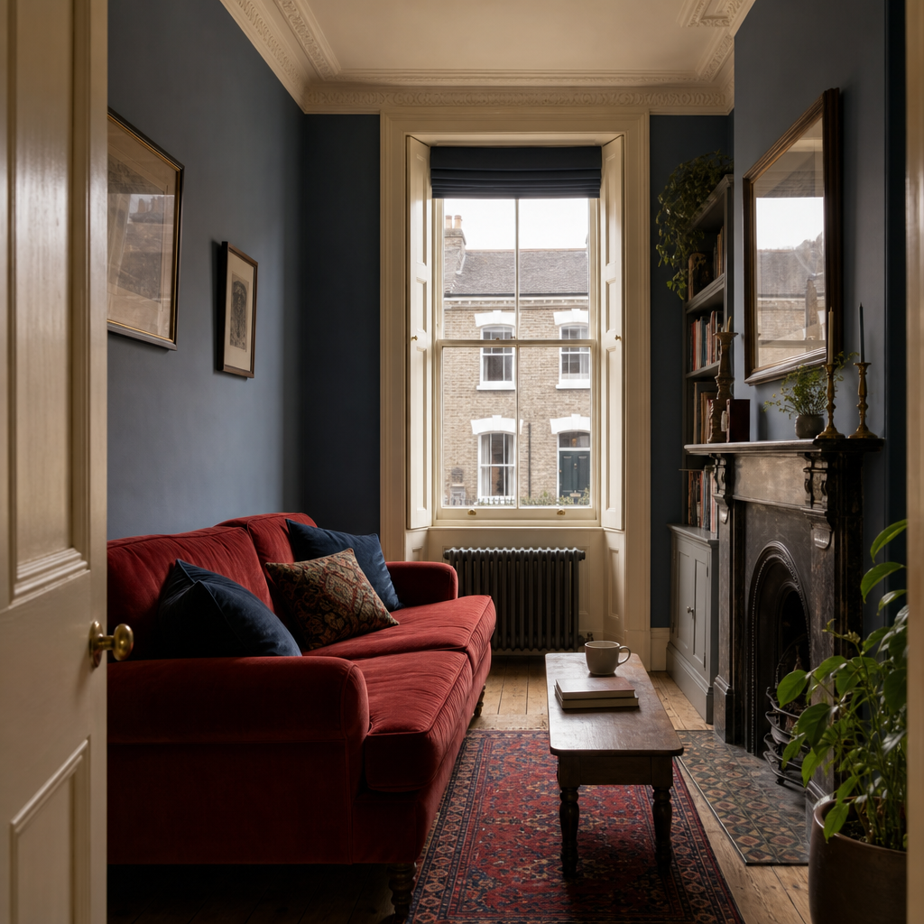
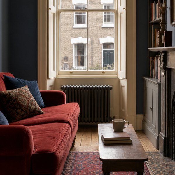
Victorian house builders knew the shape of the problem, even if they didn't know the optics behind it. Terraced houses were narrow by design – land in Victorian cities was expensive, and a 12-foot-wide parlour was an entirely ordinary thing to live in. The decorators who worked those rooms used deep, warm reds and golds on the end walls, the short walls that face you as you enter, and cooler shades on the long side walls that seemed to squeeze you in. Or simply less saturated versions of the same tone. The warm end walls advance, the cool sides retreat, and the room stretches sideways in your perception. For more on exactly how Victorian decorators developed this as a deliberate craft, Your Walls Are Lying To You (And They've Been Doing It Since The Victorian Era) on Homeytips gets properly into it.
It Runs the Other Way Too
The same principle runs in the opposite direction, which is useful. A long, thin corridor painted in a warm terracotta at the far end will appear to shorten – the end wall steps toward you. A low ceiling painted a warm cream sits heavier and closer than the same ceiling in a cool white. Paint a ceiling a slightly cooler shade than your walls and it lifts, just slightly but noticeably, because cool colours quietly recede.
None of this requires expensive paint or a decorator's eye. It just requires knowing what your eye is actually doing when it looks at a colour. Once you understand that your lens is physically straining differently at red than at blue, "this room feels a bit small" stops being a mystery and starts being a diagnosis. The room isn't small. It's just been painted the wrong colour. A tin of paint in the right undertone costs the same as one in the wrong one.
Questions this raises
- Why does the effect still work once you know it?
- Do colour blind people see this differently?
- Is the effect stronger under artificial light?