Pick up any tin of paint with a name like "Pebble Shore" or "Whispering Stone" and the word neutral is doing a lot of heavy lifting. It promises a quiet, well-behaved wall that gets out of the way and lets your furniture do the talking. What it doesn't mention – what the name is actively designed to stop you thinking about – is that every single neutral paint on earth has a hidden colour baked into it. Not a subtle suggestion of colour. An actual cast, a lean, a tint that will crawl out of the tin the moment natural light gets hold of it and do something quite startling to your room.
Decorators Knew This in the 1880s
Painters and decorators in the 1880s understood this in their bones, because they had to. When you're grinding your own pigments and mixing by eye, you can't hide from the fact that white isn't really white – it's a combination of lead or zinc or titanium with a handful of other things, each pulling the final colour in a different direction. Add a touch of raw umber and you get warmth. Add a sliver of Prussian blue and suddenly you have a white that sits cool and clean against pale winter light. Victorian decorators were making deliberate choices about undertones without knowing the word for it. The knowledge lived in their hands.
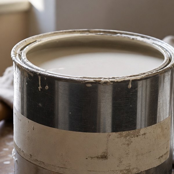
Then mass production arrived, the colour was locked behind a label, and the label got a whimsical name. "Elephant's Breath." "Mole's Whisper." "Old Stone." Marketing names that tell you precisely nothing about what the paint is actually doing optically, but sound rather pleasingly like a crossword clue.
Why do some greys turn purple indoors?
Here's what's actually happening when your grey goes lavender. Pigment doesn't reflect every wavelength of light equally – it absorbs some and bounces others back at your eye. A grey made with a touch of red and blue pigment will, under warm incandescent light, absorb some of the yellow cast from the bulb and throw back the blue and red that remains. Which is violet. Which is why your perfectly chosen grey now looks like a nursery. The room hasn't changed. The light has just revealed what was always in there.
Warm and Cool Undertones
Warm undertones – the reds, yellows and oranges lurking inside your "nude" or "oatmeal" – behave the opposite way under cool north-facing daylight, turning a peachy pink that nobody intended. Neither of these is a disaster or a mistake. It's physics being perfectly straightforward. You can read more about how Victorian decorating intuition maps onto this modern colour science over at Your Walls Are Lying To You (And They've Been Doing It Since The Victorian Era).
How do you spot a paint’s undertone before buying?
The practical upshot is just this: when you're testing a paint sample, you're not really testing the colour. You're testing the undertone under your specific light. Leave the sample up for two or three days. Look at it at noon and again at dusk, because what you're watching for isn't the paint changing. It's the undertone announcing itself, which it will do every single day you live with it.
Questions this raises
- Which neutrals suit a north-facing room?
- Does the undercoat colour affect the final shade?