
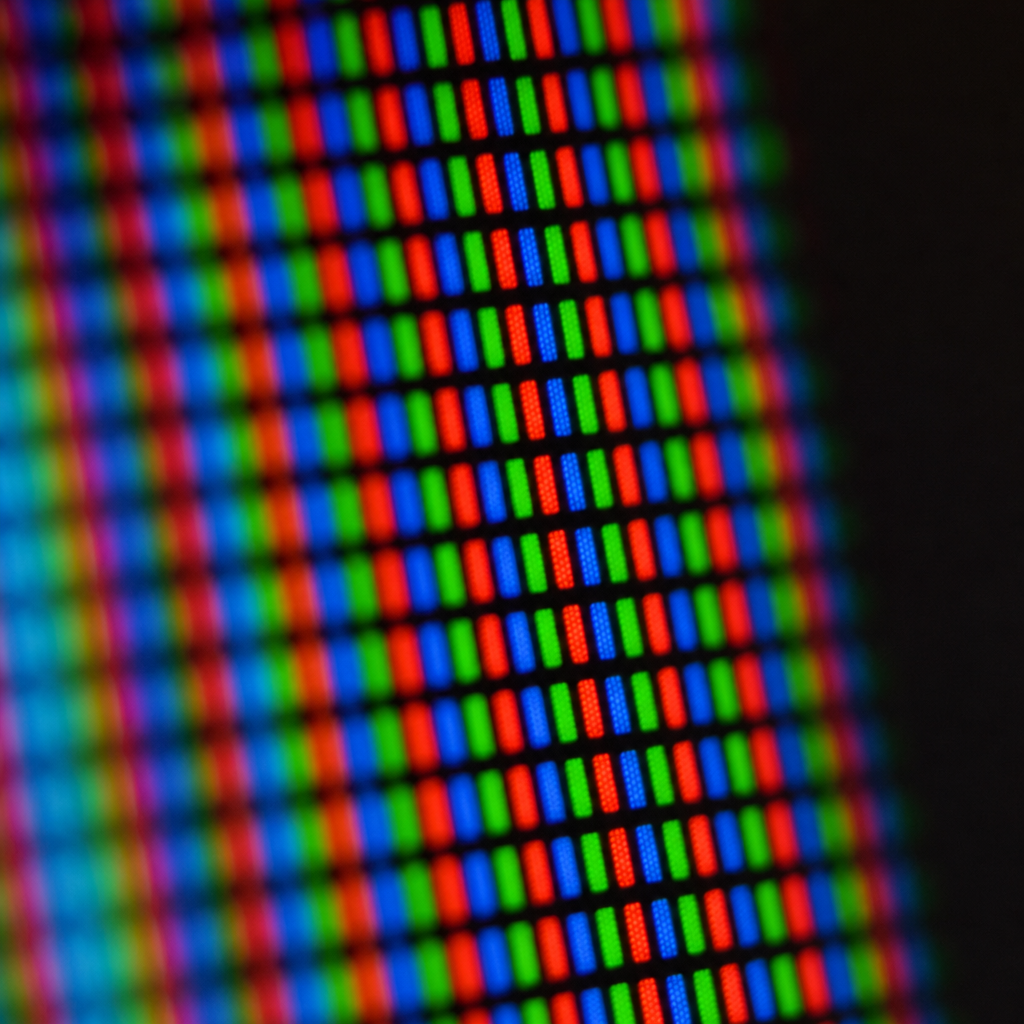
Hold your phone at arm's length and look at anything on it. A blue sky, your friend's red jumper in a photo, the slightly threatening orange of a news alert. Now consider that none of those colours physically exist on the screen. Not one of them. What you're actually looking at is a grid of tiny lights – each one capable of producing only three shades: red, green, and blue. That's it. Three colours, and your brain is doing the rest.
The Pixel’s Great Hustle
This is the pixel's great hustle. Each pixel on your screen is really three subpixels sitting side by side – one red, one green, one blue. The screen adjusts how brightly each one glows, and your visual system blends them together into something it confidently reports back as "turquoise" or "the exact shade of a London bus". You're not seeing a colour on the screen. You're seeing a suggestion, and your brain is filling in the gap.
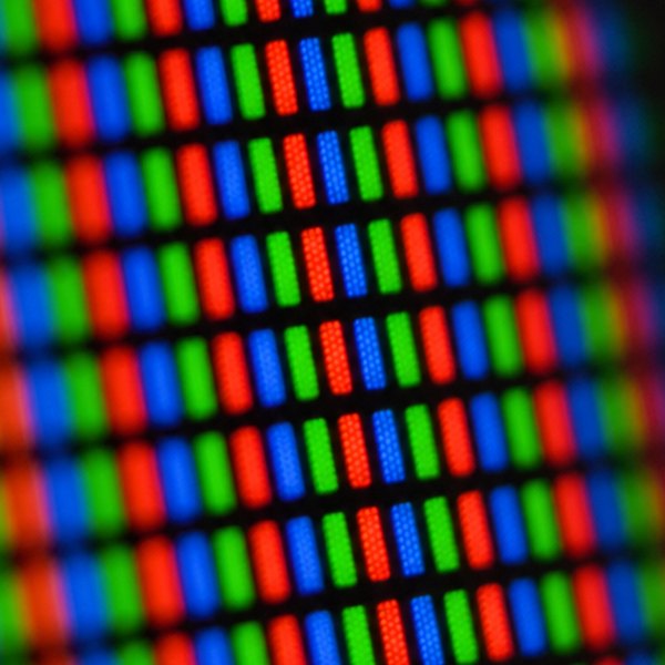
It is, when you think about it, an audacious lie. Green doesn't exist in the glass. Yellow certainly doesn't. That warm amber you're using as a phone wallpaper? That's a red subpixel and a green one, turned up to specific brightnesses while the blue one sits there doing nothing, and your visual cortex invents amber on their behalf.
Why do colours look different on each device?
The reason the same photograph looks so different on your phone, your laptop, and your colleague's monitor across the office is simple: each screen is telling a slightly different version of this lie. The range of colours a screen can suggest is called its colour gamut – essentially, how wide a vocabulary of fabrications it has available. A cheap laptop might have a fairly limited range, reproducing everything in colours that are technically correct but slightly flat and unconvincing. High-end phone screens have a much wider gamut and will confidently invent colours that cheaper displays can't even attempt.
Colour Profiles and Calibration
Colour profiles and calibration are essentially attempts to catch screens mid-fib. When a photographer or a graphic designer calibrates their monitor, they're using a small device pressed against the screen to measure what colours it's actually producing versus what it claims to be producing, then nudging it back toward honesty. Professionals do this regularly because left alone, a screen drifts – warmer whites, slightly flattened blues, the whole thing sliding quietly away from accuracy. For most of us it doesn't matter. But for someone who prints photographs? The difference between the screen's invented amber and the printer's real amber is the difference between a beautiful print and an expensive mistake.
Questions this raises
- How does a printed photo differ from a screen one?
- Can a screen show every colour the eye sees?
- Do OLED and LCD screens mix colour differently?