
Somewhere around 1810, a German poet and playwright called Goethe published a dense, peculiar book about colour. Scientists largely ignored it – he was a poet, after all, wading into optics – but the bit that stuck, the bit that quietly crept into every paint chart you have ever flicked through, was his observation that colours do not just sit on a surface. They move. Warm colours push towards you. Cool colours pull away. The wall isn't just a wall; it's performing a slow, constant trick on your eyes, and it has been doing it long before anyone called it "interior design."
Why do warm colours make a room feel smaller?
The mechanics are surprisingly literal. Your eye focuses at very slightly different depths for different wavelengths of light. Reds and oranges, at the long-wavelength end, bring the focal point just in front of your retina, so the brain compensates by feeling like the surface is closer than it is – while blues and greens, at the short end, focus just behind the retina and nudge the surface back. Warm colours advance. Cool colours recede. This is not metaphor or mood-boarding language; it is a measurable optical effect, and Goethe's followers spent a good part of the nineteenth century documenting it in detail.
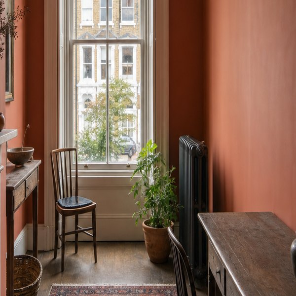
Which means the classic advice – paint a small room a pale, cool colour to make it feel bigger – is not a trend or a magazine opinion. It is applied optics. A soft blue-grey on all four walls genuinely does push them back a few perceptual inches. A deep terracotta does the opposite with just as much reliability. The room doesn't change. Your brain does.
Where the Research Was Actually Done
What the paint charts don't mention is where most of this research was actually being done. The people most interested in colour's effect on perceived space and time were not decorators. They were factory managers and asylum directors. A worker in a low-ceilinged warehouse painted ochre felt oppressed and worked badly. The same ceiling in a cooler tone felt higher, the day felt faster, the space felt bearable. Researchers in the late nineteenth and early twentieth centuries ran careful experiments on this – measuring how long subjects thought they had been sitting in rooms of different colours, how warm they felt, how much space they thought surrounded them – and the results fed directly into what we now call colour psychology, and eventually, circuitously, into the Farrow & Ball shade card sitting on your kitchen table.
Which colours make a low ceiling look higher?
The ceiling trick is one of the stranger findings. Paint a ceiling brilliant white and it reads, to your eye, as the furthest surface in the room – it recedes, which is what you want. But paint the ceiling the exact same white as the walls, with no contrast between them, and the ceiling suddenly appears to drop. The lack of distinction collapses the boundary; your eye can't find the edge, and the room contracts. A slightly warmer, slightly deeper ceiling tone actually helps by creating contrast, even though "warm" tones are supposed to advance. Contrast is doing more work than the colour itself in this particular case, which is why the rule breaks, and why "just paint everything the same shade" reliably feels wrong without anyone being able to say exactly why.
Light Temperature Complicates It
Light temperature complicates all of this cheerfully. The colour on your wall is only ever the colour on your wall in a particular light – a cool, grey-blue paint looks calm and spacious in north-facing daylight and faintly grim and cave-like under a warm tungsten bulb at seven in the evening. Paint manufacturers know this, which is why most of them now print the undertone – the hidden bias in the pigment – somewhere in the small print. A white with a green undertone will turn a sickly, institutional colour in warm artificial light. A white with a pink undertone will bloom and warm up under the same bulb. The undertone is where the real decision is.
So the next time a room feels inexplicably smaller after you've repainted, or a colour you loved on the sample card looks completely wrong on the wall, it isn't bad luck. It's Goethe's fault, really, and the Victorian factory managers who followed his thinking into places Goethe never imagined.
Questions this raises
- Does Goethe's colour theory hold up scientifically?
- How much can paint colour change perceived room size?