Stand in your living room for a moment. Now ask yourself: do you actually know how big it is? Not in metres, not with a tape measure, but in the felt sense of the thing – the way it hits you when you walk in. Chances are you have an answer, something like "it's a bit poky" or "it feels quite airy, actually." But here's what's interesting: that answer has almost nothing to do with the room's real dimensions. Your brain didn't measure anything. It just read a set of clues.
This is the thing professional interior designers understand that most of us don't: a room isn't a physical fact you perceive. It's more like a sentence your eye follows, drawing conclusions from contrast, line, tone and colour the way you'd draw meaning from punctuation. Move the full stops around and you change what it says.
How do you make a narrow room feel wider?
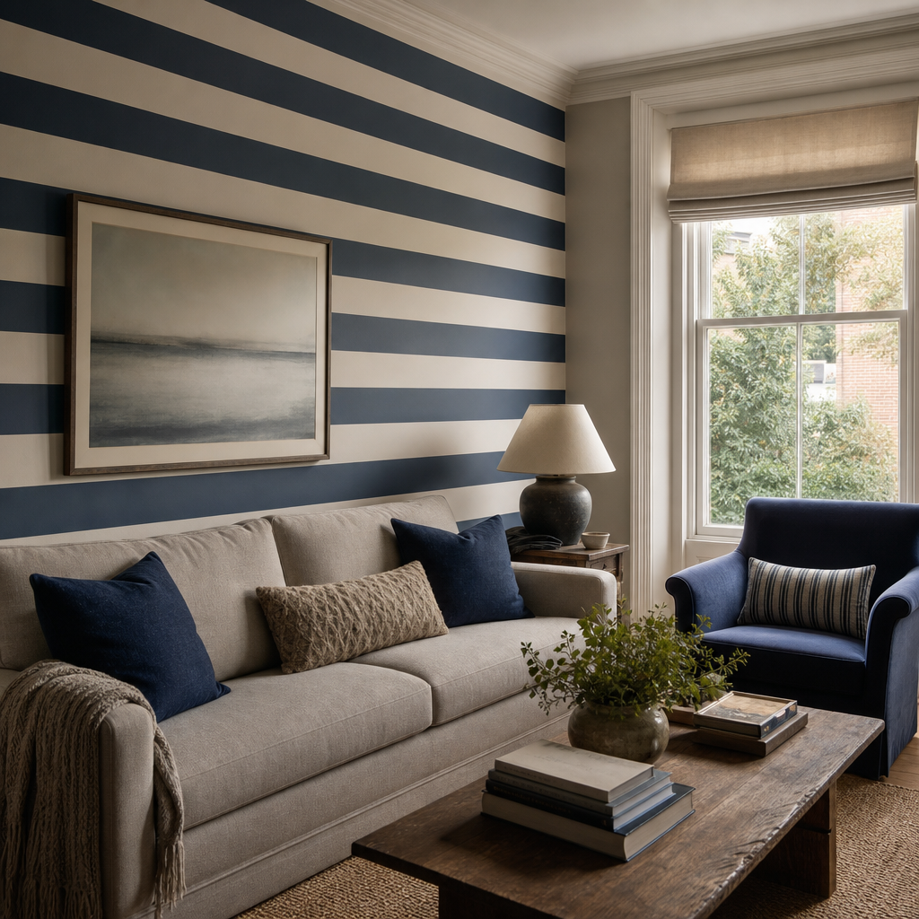
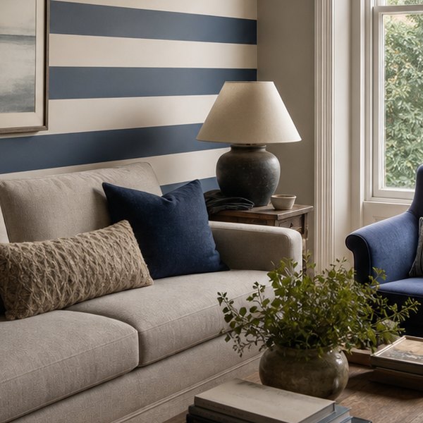
Take horizontal stripes on a wall. Your brain reads anything that runs left to right as something wide, because that's the direction width travels, and it doesn't double-check with a spirit level. So a wallpaper with strong horizontal banding will push the walls apart in your head, even if the room is the same narrow corridor it's always been. Flip that to vertical stripes and the eye follows them upward. Suddenly the ceiling has climbed about a foot, at least in felt terms.
This is why designers talk about "leading the eye." They're not being poetic. They mean it quite: lay down a track and the eye will travel it, and wherever it ends up, the brain takes that as the room's edge.
The Contrast Trick That Makes Walls Disappear
Contrast is another big lever. Paint one wall in a sharp, saturated colour and the brain locks onto it immediately – that wall becomes the room's focus, which also makes it feel closer and more dominant. Designers use this deliberately when a room is awkwardly shaped: draw attention to the short wall at the end of a long tunnel room and suddenly the proportions feel more balanced. You're not following the long axis anymore.
The reverse trick is painting everything the same – walls, skirting, even doors – in one low-contrast tone. Removes all those visual anchors. The eye has nowhere to stop, and a small room starts to feel looser and less cluttered. This is the "paint it all the same dusty white" idea that keeps resurfacing in interiors, and it works precisely because the brain stops reading individual surfaces and starts reading the space.
For more on how colour and contrast play these kinds of games on your walls, visit Your Walls Are Cheating Your Eyes (And Your Eyes Don't Mind At All) at https://homeytips.co.uk/decor/your-walls-are-cheating-your-eyes/.
Tone Is Doing More Work Than Colour
Light tones visually expand; dark tones absorb. You probably already knew that. What's less obvious is that tone matters more than the actual colour. A deep navy ceiling sits down on you in a way that a pale lavender ceiling doesn't, even though lavender is hardly anyone's idea of a neutral. It's not really about the hue. It's about how much light the surface appears to reflect, and the brain interprets that as depth.
So when a designer specifies something like "a warm mid-tone terracotta" for a north-facing room, they're not picking what's fashionable. They're compensating for the cold, flat light that would make a cooler colour read as grey and heavy. The walls become warm instructions rather than cold ones.
The real job, then, is not moving walls. It's rewriting what the room tells you it is.
Questions this raises
- Does a large rug make a room look bigger?
- Which mistakes make a room feel cramped?
- Why do mirrors work in some rooms and not others?